Overview
Payroll is the core of Paylocity's product: the workflow HR administrators rely on every pay period to review timecards, process pay, resolve errors, and submit payroll on time. As part of a broader "Payroll Refresh," the team was redesigning this experience to close usability gaps and modernize a workflow that hadn't kept pace with the rest of the product.
I led the Phase II usability study, evaluating a redesigned prototype of the full run-payroll experience, from starting payroll through to submission, with a mix of current customers and non-customers.
The Problem
Running payroll is high-stakes and time-sensitive: errors are costly, and admins need to feel confident every step of the way. Internally, Sales had also flagged payroll as a weak point in demos. In 2023, only 28% of Sales Consultants considered payroll "competitive," improving to 65% by March 2024, but with clear room left to improve.
The team needed to know whether the redesigned prototype actually closed the gaps admins experienced in the current product, particularly around navigation, comparing payrolls, and the dated UI, without requiring changes outside existing system and technical constraints.
Research Goals
- Identify usability, learnability, and discoverability gaps in the redesigned run-payroll experience.
- Uncover barriers to content comprehension across the workflow.
- Understand how customers actually process payroll, end to end.
- Determine the visual efficacy of the proposed designs.
Research Approach
I ran 60-minute moderated usability sessions with 10 payroll administrators (5 current Paylocity customers and 5 non-customers) across healthcare, automotive, manufacturing, and higher education. Each participant worked through a series of realistic tasks in an interactive prototype covering the full run-payroll journey: checking outstanding approvals, reviewing timecards, creating a batch, adjusting pay, resolving errors, comparing payrolls, and submitting for approval. Sessions ended with a System Usability Scale (SUS) survey and an open discussion of their experience, challenges, and expectations.
Key Findings
75.5
SUS score, above the industry standard (68), with room to reach the design-iteration goal of 85.
40%
complete success rate on "import timesheets," one of the lowest-scoring tasks in the study.
50%
complete success rate on "resolve errors." Language and feedback issues left admins unsure if fixes had worked.
40%
complete success rate on "fix variance." Small text made differences between payrolls easy to miss.
The study surfaced issues across nearly every stage of the workflow:
-
Checking outstanding approvals comes too late. Admins expect to review outstanding approvals before starting payroll, but the redesigned Timecard Summary page was only reachable after clicking "Start Payroll," which several participants read as an action that would immediately run payroll. Participants instinctively looked for an "Approvals" link in the header or on the landing page instead.
-
Timecard Summary is missing functionality admins rely on. Even once found, the page didn't show the on-screen Master Timecard Summary or additional pay types/earnings, forcing admins back into Time & Labor and breaking their flow.
-
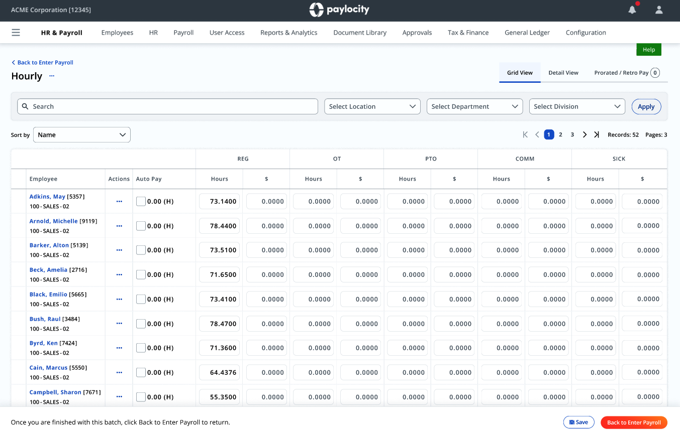
The Details page is hidden in plain sight. On the Pay Grid, participants didn't realize that clicking an employee's name opened the Details page where additional earnings codes could be added. Most clicked the Actions icon instead, expecting that to be the entry point.
-
The earnings code list overwhelms. Once in Employee Details, a long, code-first list of earnings options made it hard for admins unfamiliar with specific codes to find what they needed quickly.
-
"Dismiss" sends the wrong signal. In the Review step, several participants believed the "Dismiss" button would cancel or reject a pending direct deposit change, rather than acknowledge it, and some expected an "Approve" option that wasn't there. Separately, not all resolved actions were reflected as completed, leaving admins unsure whether their fix had actually taken effect.
-
Small text hides real variances. On the Summary page, several participants overlooked payroll differences entirely because the comparison text, including a 50% variance figure, was too small to register, especially next to the chart.
-
The "compare payrolls" feature isn't useful for everyone. Admins in industries with highly variable payroll (healthcare, manufacturing), where overtime and PTO swing widely period to period, said a period-over-period comparison wasn't meaningful, and they skipped it entirely.
-
Errors are caught earlier than the Summary page. By the time admins reach Summary, most hour-related errors have already been caught while reviewing timecards or during an audit, meaning Summary needs to support a different kind of review, not duplicate one that's already happened.
Recommendations & Impact
Recommendations were scoped to be testable within existing technical constraints, and organized so Product could prioritize by effort and impact:
- Reposition the approvals check. Surface outstanding approvals before "Start Payroll" is framed as the entry point, or make Timecard Summary reachable from wherever admins naturally look first (header, landing page).
- Bring Time & Labor into Payroll. Let admins review individual employee timecards and all pay types directly from Pay Entry, so they're not forced to leave the payroll flow.
- Make the Details page discoverable. Surface "Check Details" from the Actions menu on the Pay Grid, since that's where admins look first.
- Restructure earnings codes. Add search, lead with plain-language descriptions instead of codes, and group options into Earnings, Deductions, and Taxes.
- Fix Review language and feedback. Rename "Dismiss" to "Marked as Reviewed," and ensure every resolved action, including high-risk pay frequency flags, shows as completed for audit purposes.
- Improve variance visibility. Increase default text size on Summary and support browser zoom / text resizing, in partnership with the design system team.
- Rethink the default Summary view. Rather than leading with a payroll-to-payroll comparison, offer an alternative visualization and employee-detail view that delivers value to admins whose payrolls vary too much to compare meaningfully.
- Progressive disclosure for Batch Setup. Move rarely-used options under an "Advanced features" section, since most admins only name or merge batches.
- Add a way to loop in supervisors. Give admins an in-product path to contact a supervisor before editing an employee's hours, something they currently do outside the product as a matter of course.
These findings and recommendations were shared with Product for prioritization in the following quarter, with the highest-impact changes, particularly around approvals placement and error resolution language, queued for validation in the next round of usability testing.
Reflections
What stood out most in this study was how often the "right" answer depended on context the design alone couldn't communicate, like the fact that admins in variable-payroll industries don't find payroll comparisons useful, while others do. It reinforced that "redesign the UI" isn't enough; you have to design for the variety of mental models and workflows admins bring with them, especially in a product as deeply embedded in someone's routine as payroll.
I also came away with a sharper appreciation for how much small language choices matter in high-stakes flows. A single word like "Dismiss" was enough to make several admins hesitate before completing a task they otherwise understood perfectly well.